Cole Holyoake

Experience lead, PaperKiteBased in 

BP Product design

Bringing Everyday Rewards to BPme
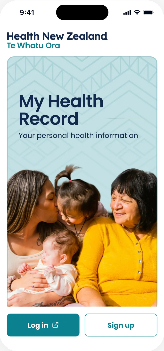
Te Whatu Ora Product design

Accessible health records for every New Zealander
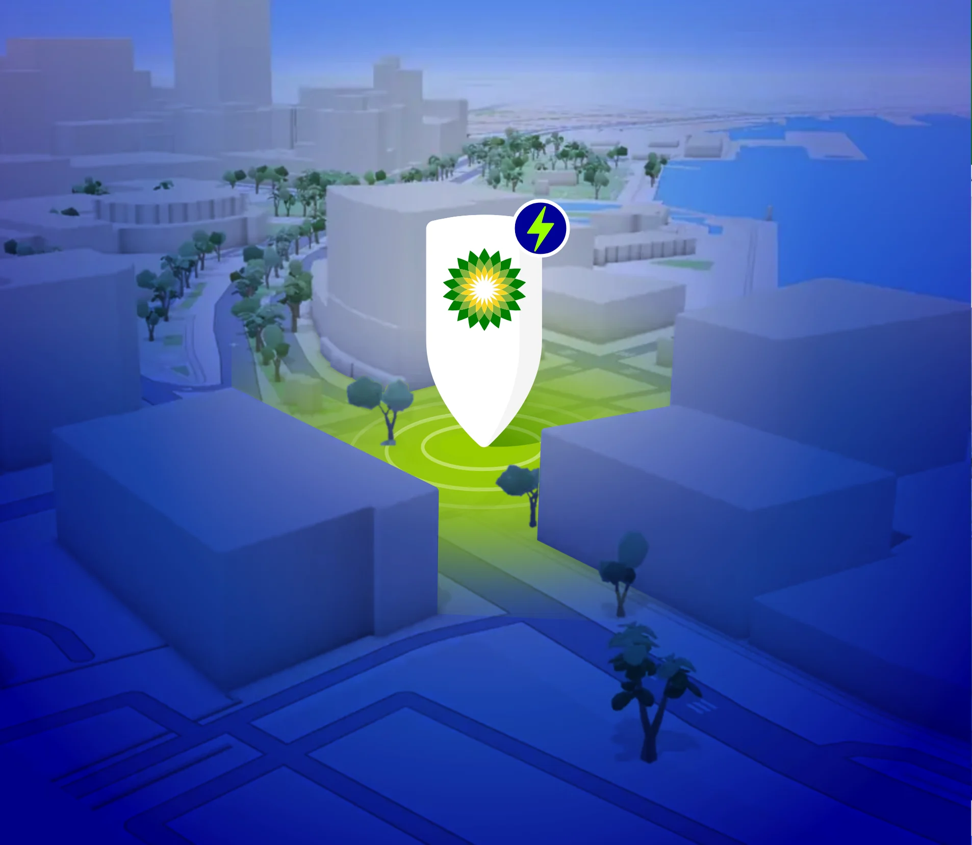
BP UX research

Understanding EV driver needs

Life Education Trust Service design

Mapping the end-to-end delivery of Healthy Harold
PaperKite DesignOps

Templates and processes for presales, design and delivery

Illustrated self-portrait: Cole in a cap and glasses, grinning as he rides a skateboard down a street in Ōtautahi

About

I lead experience design at PaperKite, a digital product agency in Aotearoa, guiding the creative vision across our mahi & shaping how we practise design.

I believe great products start with people. Bringing that perspective to my work, I move naturally between the big picture and the smallest details, from the strategy that gives a product direction to the interactions that bring it to life.

Over a decade in digital design, I’ve applied that approach across energy, banking, health, education, government, manufacturing, the arts & emerging tech. And with a background in web development, I’m embracing the evolving world of AI-assisted design and build.

Clients
  • bp Global, NZ & AU
  • BNZ
  • Te Whatu Ora | Health NZ
  • MasterChef World
  • MPI Fisheries NZ
  • Driving Miss Daisy
  • Pātaka Art + Museum
  • & more

When I’m not working

[A line or two about you outside work: what you love, what keeps you curious]

  • I like to skate

  • Hiking a snowy ridge

    I like to hike

  • A garden path through the bambooLaying a stone circle

    I like to landscape

  • I like to ball

  • The sideboard, plywood and concreteAn open door and its finger pullMy mark, engraved in the topA cast concrete legThe doors and a concrete leg

    I like to build

  • Bouldering at the gym

    I like to climb

  • A blue pencil portrait

    I like to draw

Keen to catch up?

If you’re in Christchurch, I’m always up for a chat. Here’s a couple of local spots I like:

BP

Case study · BPme

Introducing Everyday Rewards

Ensure a smooth and customer-centric transition to BP’s new loyalty program, reducing pain points and maximising customer retention.

Client
BP New Zealand
Role
Product Design Lead
Result
80% of AA Smartfuel members moved to Everyday Rewards within 6 months

No margin for error

How we honoured contractual agreements of both the old and new loyalty programs

The transition from AA Smartfuel to Everyday Rewards wasn’t just a rebrand. It was a complete overnight transformation with zero room for error.

Contractual obligations meant that users would see AA Smartfuel throughout their entire experience right up until launch day. The next day, every trace had to be gone, replaced seamlessly with Everyday Rewards.

The challenge

This created an unprecedented design and implementation challenge that extended far beyond technical execution. Unlike typical feature rollouts, we couldn’t do a phased release or gradually deploy changes. We had exactly one chance to get this right.

Any missed reference, lingering copy, or overlooked touchpoint would represent a contractual breach with serious business implications. The constraints also extended to how the transition was communicated to users. BP couldn’t mention they were signing with Everyday Rewards specifically, only that they were partnering with “a new partner.” This meant designing communication strategies that prepared users for change without revealing the full scope of what was coming.

The complete audit

We conducted a comprehensive examination of the entire BPme app ecosystem. This wasn’t just about obvious UI elements: we mapped every possible user touchpoint where loyalty program references could appear.

Designing for dependencies

Recognising our dependency on Countdown’s (now Woolworths) technical infrastructure, we designed a comprehensive “break glass” solution. This wasn’t a stripped-down fallback; it was a fully-realised alternative that would deliver genuine value to BP customers if the Everyday Rewards integration faced delays.

The break glass system maintained the core value proposition while feeling authentically BP, ensuring customers would still receive meaningful benefits during their transition period.

The result

Launch day executed flawlessly.

The overnight transformation was invisible to users. They simply woke up to a refreshed experience with their new loyalty program fully integrated, never knowing the complexity of what happened behind the scenes.

Creepy or clever

How we navigated data-matching and the measures we took to ensure we got it right

The stakes

Our primary goal was clear: we haven’t lost customers to competitors. But getting there required navigating a delicate balance between technical capability and user trust.

The technical capability existed to instantly transfer users from AA Smartfuel to Everyday Rewards behind the scenes. But just because we could didn’t mean we should, at least not without careful consideration of user trust and transparency.

0%of AA Smartfuel members moved to Everyday Rewards within 6 months

The challenge

We recognised that seamless data matching could feel invasive if not handled thoughtfully. Users needed to understand and consent to what was happening with their information. Simultaneously, we understood the real-world context: customers discovering their loyalty benefits were gone while standing at a fuel pump would face a stressful situation where a complex manual signup process would likely result in abandonment.

Data-matchSign inwith passwordSign inwith magic linkRegisterWe’ve partnered withEveryday RewardsWhat’s new?Link my Everyday RewardsI agree to share my detailswith Everyday RewardsEveryday Rewards linkedWe’re adding your bonus pointsGood afternoon Susiessu.everydayrewards.co.nzEnter your detailsContinuessu.everydayrewards.co.nzEnter your detailssusie@email.comContinuessu.everydayrewards.co.nzEnter your detailssusie@email.comFinishSend a link for a password free loginSend a link to reset passwordssu.everydayrewards.co.nzEnter your detailssusie@email.com••••••••FinishSend a link for a password free loginSend a link to reset passwordssu.everydayrewards.co.nzMagic link sent!We’ve just sent an email tosusie@email.comYour Everyday Rewardsmagic linkEveryday Rewardsto SusieLink Everyday Rewardsssu.everydayrewards.co.nzLinking yourEveryday Rewards…ssu.everydayrewards.co.nzCreate your passwordContinuessu.everydayrewards.co.nzCreate your password••••••••Continuessu.everydayrewards.co.nzPlease confirm your detailsFirst nameLast nameDate of birthMobile numberFinishssu.everydayrewards.co.nzPlease confirm your detailsFirst nameSusieLast nameNovaDate of birth05 10 1995Mobile number021 123 4567Finish
Data-matching took people from the welcome screen to their linked Home with a consent tick and one tap. Without it, Everyday Rewards sign-in meant a password, a magic link or registering, through as many as six more screens.

Research-driven design

Through multiple rounds of user research, we tested various approaches to data matching, focusing on user comfort, comprehension, and trust. We developed research goals and hypothesis statements specifically around this sensitive process, testing everything from communication strategies to interaction patterns.

Intentional friction as trust‑building

Rather than an instant, invisible transfer, we designed a purposeful loading experience that clearly communicated account linking was happening. This intentional friction transformed what could have felt like a “black box” process into something transparent and trustworthy.

The custom loading experience faced pushback from Everyday Rewards’ brand team for not adhering to their guidelines. However, my thorough familiarity with their 100-page brand identity document allowed me to challenge this feedback using their own brand principles, ultimately getting the design approved as it served the user experience while respecting brand intent.

The impact

It automatically linked me without needing to add information… Impressive. I didn’t have to get my wallet, take my card out, and enter my details. That would have stopped me from doing it in the moment…

Interview participant on linking Everyday Rewards to BPme

This quote reflected the overall theme of the insights gathered. The data-matching flow reduced signup friction from a complex multi-step process to just two taps: one for explicit consent and another to continue. This meant users could quickly regain their loyalty benefits even in the time-pressured environment of a fuel station.

Everyday, brighter

How we used this as an opportunity to refresh the general experience and freshen up the outdated interface

Before
After
Before
After
Before
After

Seizing the strategic moment

While the loyalty program change was mandatory, I recognised this as the perfect opportunity to address BPme NZ’s outdated interface. Despite having access to global brand guidelines, the app hadn’t kept pace with modern design standards or user expectations.

I began designing potential solutions before receiving official sign-off, creating compelling visuals that demonstrated the transformation possible. By pairing these designs with discussions about brand identity and user trust, I generated stakeholder excitement and secured buy-in for a comprehensive refresh.

Solving cognitive overload

The biggest UX improvement was establishing clear information hierarchy on the home page. I restructured the interface to separate main service features (Pay in Car for fuel, pre-order coffee, car wash codes), account actions (adding payment methods, linking Everyday Rewards), campaigns and promotions, and contextual elements (current coffee orders, status updates).

This organisation dramatically reduced cognitive overload and made the app more intuitive to navigate.

Original
Context-aware backgroundsCMS-driven contentWeak typographic hierarchyNo clear visual hierarchyHigh cognitive loadAnimated coffee steamReflect the new loyalty mental modelHMW express the brand more strongly?Inconsistent imagery, dated iconographyOrder doesn’t reflect task prioritySurface Everyday Rewards points
SuccessfulConcerningIdea
Wireframe
Echo the BP curve from Pay in CarTooltips?Stamp cards leverage a familiar mental modelContextual stamp iconography?What do the free rewards look like?No participating-site disclosureVisible progress toward the next rewardMake rewards feel tangibleShow distance to next voucherMissing T&Cs disclosurePromote the digital card to the nav bar
SuccessfulConcerningIdea

Strategic navigation innovation

Drawing from my understanding of New Zealand’s supermarket loyalty models, and later validating this thinking against Everyday Rewards’ successful Australian implementation, I proposed including the Everyday Rewards digital card in the main navigation. Since users could now earn points on all purchases, not just fuel, this placement aligned with familiar mental models.

The decision proved correct: it became the most viewed screen in the app.

Operational efficiency

Making the entire home page CMS-manageable enabled standardised promotional templates, eliminating developer involvement in routine updates, and dynamic content across every home page element.

Design system foundation

A comprehensive component library built on Figma variables, establishing reusable components and a consistent design language to support future development.

Visual enhancement

Custom illustrations and animations throughout the experience, turning functional interactions into engaging moments that reinforced brand connection.

Key takeaways

This project demonstrated how product design leadership extends beyond interface design to strategic business thinking.

By proactively identifying opportunities within constraints, building stakeholder alignment through compelling design work, and prioritising user trust throughout complex transitions, we turned a high-risk loyalty program migration into a comprehensive product evolution that strengthened both user experience and operational capability.